
Tuesday, May 12, 2009


Thursday, April 30, 2009
explaination
The reasoning behind my poster is my topic was animation. This project was the one I was most into, unlike the other projects in this class, this idea went through over 4 stages of developement before I actually chose the layout I wanted, and the characters I wanted to incorperate. The idea to make my poster into a "comic strip" like layout, came from the idea that illustration, and comics are the flat non moving cousins to animation. So in order to get the feeling of cartooning, and animation, naturally comics came to mind.
As far as the history part behind the project goes, I wanted to give people a very simple look into the art of animation and how difficult it really is without completely BORING everyone to death, as the topic isnt a boring one what so ever, so why make the poster boring? so i made a joke about it in my poster. as for art elements, i tried to implement the rule of thirds by placement of characters and text off center, and by haveing the characters looking at eachother or communicating from the top to bottom, it takes the eye all over the piece. so my goal was to create a fun and friendly poster that anyone can pick up and hopefully appretiate the love that goes into animation from the artists invlved, or at least respect the work animators put into their jobs.
As far as the history part behind the project goes, I wanted to give people a very simple look into the art of animation and how difficult it really is without completely BORING everyone to death, as the topic isnt a boring one what so ever, so why make the poster boring? so i made a joke about it in my poster. as for art elements, i tried to implement the rule of thirds by placement of characters and text off center, and by haveing the characters looking at eachother or communicating from the top to bottom, it takes the eye all over the piece. so my goal was to create a fun and friendly poster that anyone can pick up and hopefully appretiate the love that goes into animation from the artists invlved, or at least respect the work animators put into their jobs.


Tuesday, April 21, 2009

Tuesday, April 7, 2009
3 favorites
My First favorite poster is the Iron Man poster. the reason this poster engages me is how the heads of the characters draw you into the text of the poster. the level of importants of each character starts at the top from very, to the bottom, not very important. The text itself feels very machanical, which fits with the movies theme.
My second favorite is the Dark Knight poster of all three characters faces. the most important thing is the formality of the piece. very formal, as the text is perfectly aligned with the character images. the text also nests at the top, and the spacing is varied between words. The choice to give each character something important to them in thier hands is also an interesting choice.
My last favorite is the Indiana Jones poster. the artisic design, of a painted look fallows suit with the older movies, and shows Indy standing tall and strong despite his age. the image has a deep red pulsating background, with relics surrounding the red gap in the background. subliminally you see a skull in the red, but it doesn't look like a human skull, this makes the viewer twice as interested. also the indiana jones lettering is subliminally aligned with the skull in the background.
Monday, April 6, 2009


posters

text aligned with image^

varied letter spacing^

nesting text^

overlapping text^
 type weight^
varied scale of type^
 varied opacity^
Tuesday, March 31, 2009
final stamp

the style I chose was Art Nouveau as I thought that would be the best way to go about using hand rendered imagery. After studying a few posters from the nouveau period, i saw that the text was always strong, bold bubble lettering, and the image was usually encased with a fancy border.
so the design process behind my work was to duplicate this style from the best of my abilities, so I centered my tiger, putting it in the "dead" center, not off to the side where the natural center is, as i noticed a lot of posters from this period had centered images with text surrounding them. the text, I tried to keep it "wild" and natural looking, so it would blend in with the image and the jungle leave border.
2nd round
 these are my second rounds, here I started focusing on the style more. I really wanted to replicate the style of art nouveau with sleek hand rendered text and imagery.

Tuesday, March 10, 2009
art nouveau posters


The idea I had for my stamp was to use the nouveau style, all hand rendered and drawn out. I really enjoy this talented hand drawn style. hand rendered imagery/posters/stamps in our current day society are classic and hard to find gems
Wednesday, March 4, 2009
favorites

the reason i chose these three comic stamps are because the design concepts behind them. I like the idea of simply shrinking down a comic book cover for a stamp. In doing so, the work is already done. The designs themselves are dynamic and use the rule of thirds very well, all focusing on the main text then moving the viewer downwards towards a central figure, and then carryiong the eye back upwards with additional secondary text (most of which impossible to read on the size of a stamp) but it's a "cute" idea for comic book lovers to use these covers as postal tags.
 the reason I chose this stamp is because unlike the others, it was designed as a stamp to be a stamp. also implementing the rule of thirds placing faces on the (actual) visual center: the middle/top right corner, or left, the stamp is a simple painting of the first meeting between two famous Disney characters.
Tuesday, March 3, 2009


Monday, March 2, 2009
more stamps

the reason i chose theses stamps is, unlike the marvel stamps i chose, these were on on large sheet ment to be broken up, so not only did the designer have to worry about the stamp design, but all the pieces as a whole. the idea just got me thinking and impressed me

Tuesday, February 17, 2009
Poster explaination
The Historical event i chose was the Inauguration of the new president, Barack Obama. Barack, is the nation's first African American president, along with that huge step forward, he brings with him a lot of hype on his back. Stepping into the office at this time in our history will be no easy task though because of the recession we're falling into, but the reason Barack was selected for the job was because the people see him as best fit for the position. so the main idea my poster is trying to portray is in-fact the idea of change, hope, and the hope that the new president can pull us out from the dark hole we have dug ourselves into.
I really wanted to focus on the idea of the "winds of change" and show obama in a powerful manor cutting through Bush and the nation's problems and to show them fading into the past.
My focal point is the text: Obama, as it slices Bush in half. and it is placed on the top right/middle of the space, to emphasis the rule of thirds. After the eye catching bold lettering of Obama, I wanted the eye to move downward to see "bail out" a secondary and less tense focal point, more subtle and not filed in. and lastly i wanted the viewer to notice the fading words in the background of the piece, as they are extremely light and meant to be noticed last.
I tried to incorporated movement in my piece by careful choice of word, as when the viewer reads "war" for instance, they will naturally look back up to, or simply think about the focal point and incorporate "war" with Bush.
Lastly, balance and visual weight. as I partly covered them above, my visual weight is supposed to be heavy and strong on the top of the design to help maintain Obama as the main idea in bold text. Trying keep the rhythm, I made my secondary focal point (Bail Out) in a smaller and less eye catching text, but kept the important weight to the words with the heavy shadowing of "crisis" and "war" right behind it.
So that's my piece. Hope you enjoy, and feel free to comment.

Thursday, February 12, 2009

1st thumbnails
 these are my first ideas for my design. the top two layers were for my 911 idea, as i still wasn't sure what I wanted to do yet, the rest are first round Obama thumbs.
Tuesday, February 10, 2009
new topic
After long consideration, I ended up deciding to use Obama's inoguration for my topic for my project instead of 911. Barack Obama is coming into the white house at a troublesome time for our nation. Bringing with him to the Seat, Obama promises change and hope to help bring our nation out of it's current slump.
Monday, January 26, 2009
5 historical events
My choices for historical events:
World War 1
Obama's inauguration
911- world trade center falls
First video game for public- Pong
the great depression
911- the al Qaeda attacked U.S. soil with consecutive suicide crashings of hijacked airplanes into the world trade center buildings in new york city. this took place on September 1th, 2001 around nine in the morning. the reason this event is so significant is because it started americas war on terror and sparked intense national pride for america. the enemy was such a confusion to america that it targeted afganastan and then moved to iraq. President bush sent troops in to find and take out "weapons of mass destruction" that were never confirmed to actually exist, and osama Bin ladden who was the leader of the al Qaeda and Saddam Hussien, the president/dictator of iraqi became huge targets as well, as they had involvement in the attacks. eight years later, we're still in iraq because the ilsamic resistance to the u.s.a. osama bin ladden has yet to be found, but Hussien was found and killed.
Thursday, January 22, 2009
movie poster
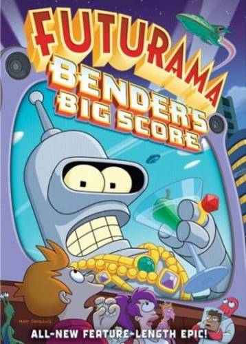
I Liked this image because it's a show that i like, and this design is very aesthetically pleasing to me. the reason i'm directly drawn to this image is because of the bright and highly saturated color scheme of the design. the design doesn't fallow normal design setup as the image is docked to the left side of the ground, and nothing important is centered, or in the natural top right corner. the large face under the text, takes the main focus, and slowly your eyes move from the largley propotioned face to the smaller secondary characters on the bottom of the page. the bottom characters are all in darker and more neutral colors, not taking away from the main character's focus in the design. this makes the rythm smooth and takes you all around the image. all of the proximity is taken up, and the image covers several planes, forground (characters on bottom) middle ground (the giant televison with the face in it) and the background (the text, buildings, and the rocket ship) all of these design principles add for an aestheticaly pleasing design.
Subscribe to:
Posts (Atom)
